Svendborg Kafferisteri
A little character in every cup.
An identity and packaging presentation for a Danish coffee roastery, bringing together the craft of roasting and a distinctive, playful mark.
01 / 03
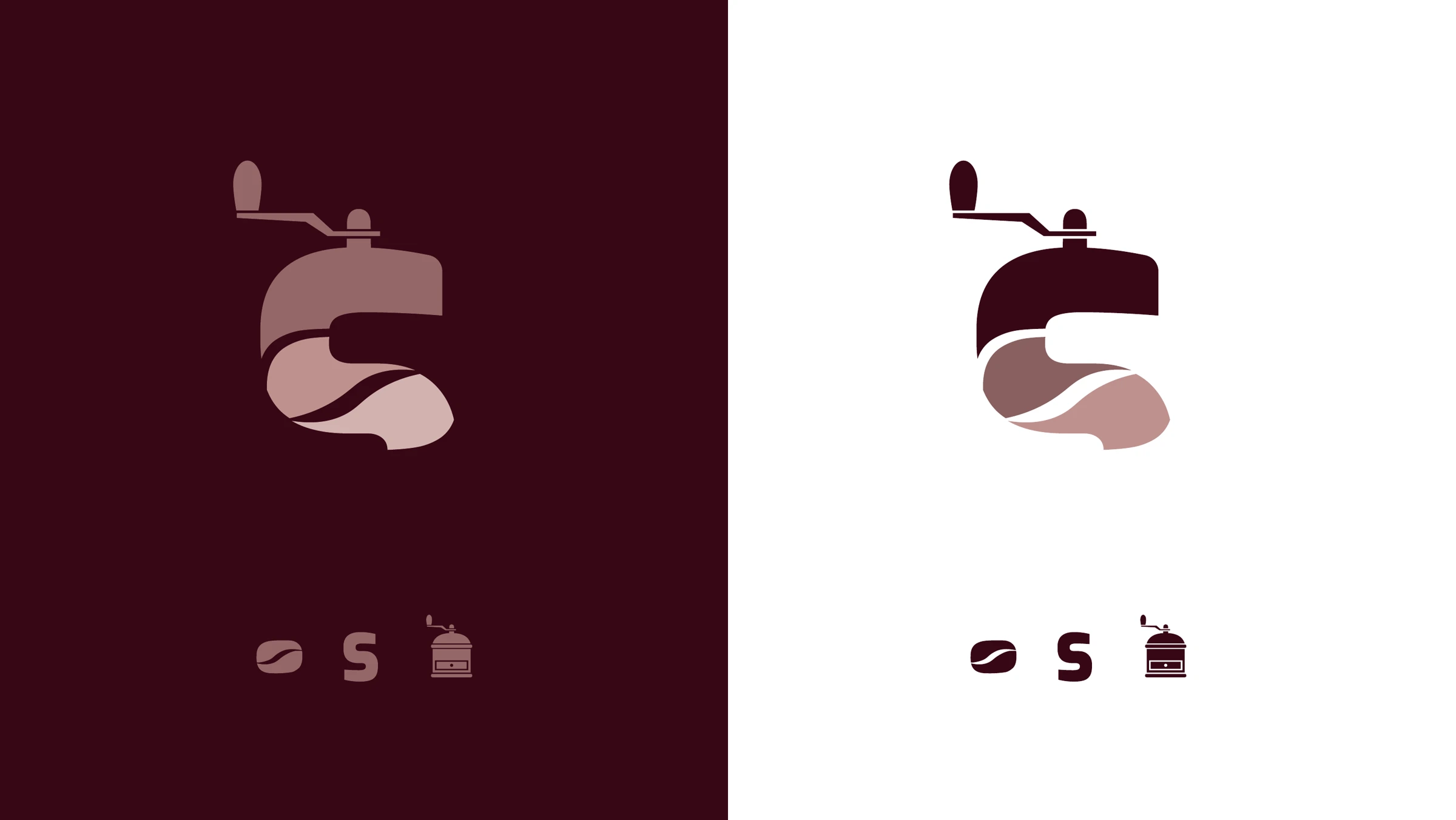
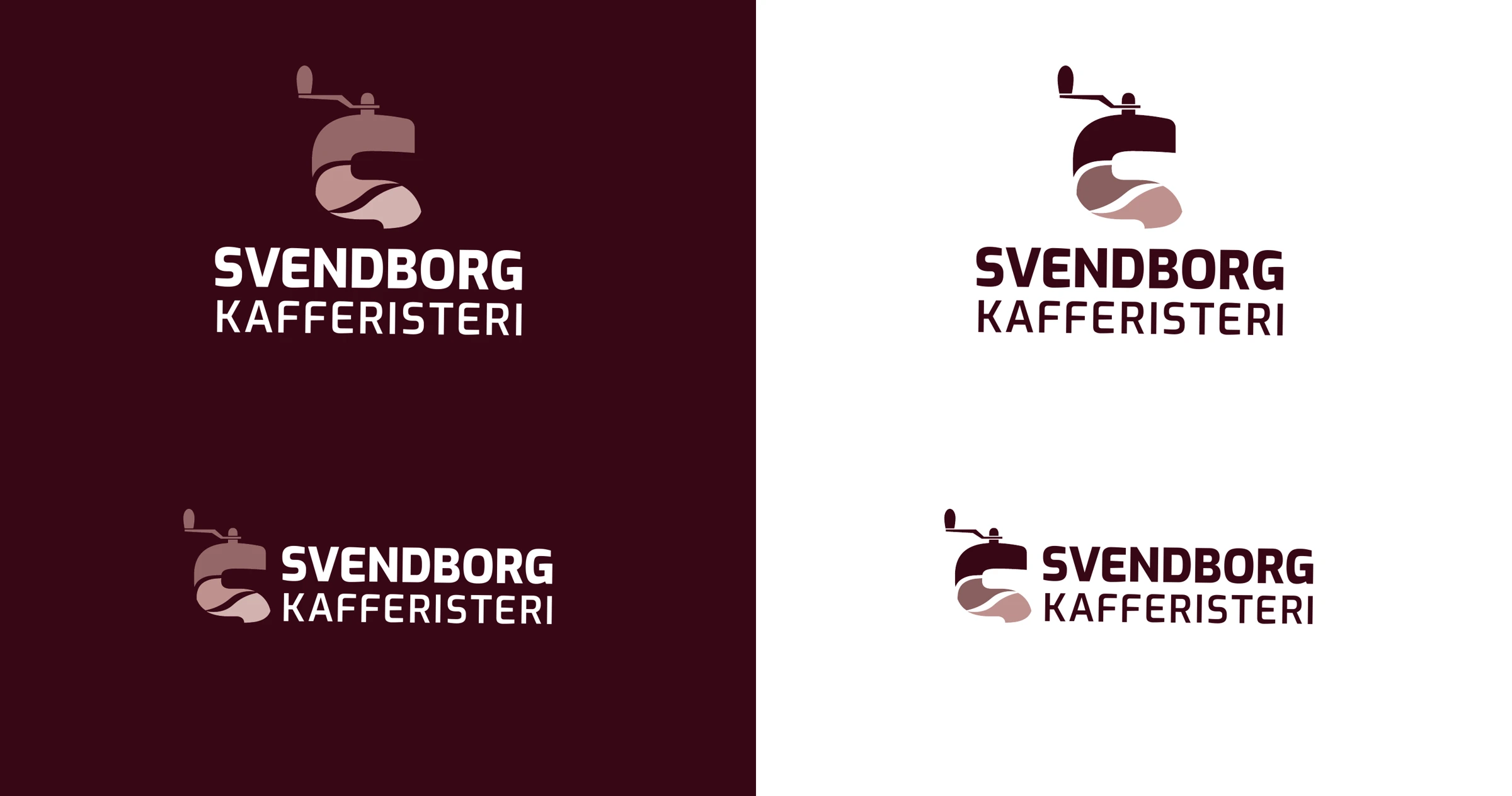
The craft, in one silhouette.
A grinder and a coffee bean combine in a playful mark. The smaller elements show how the product and the craft come together in the final silhouette.
02 / 03
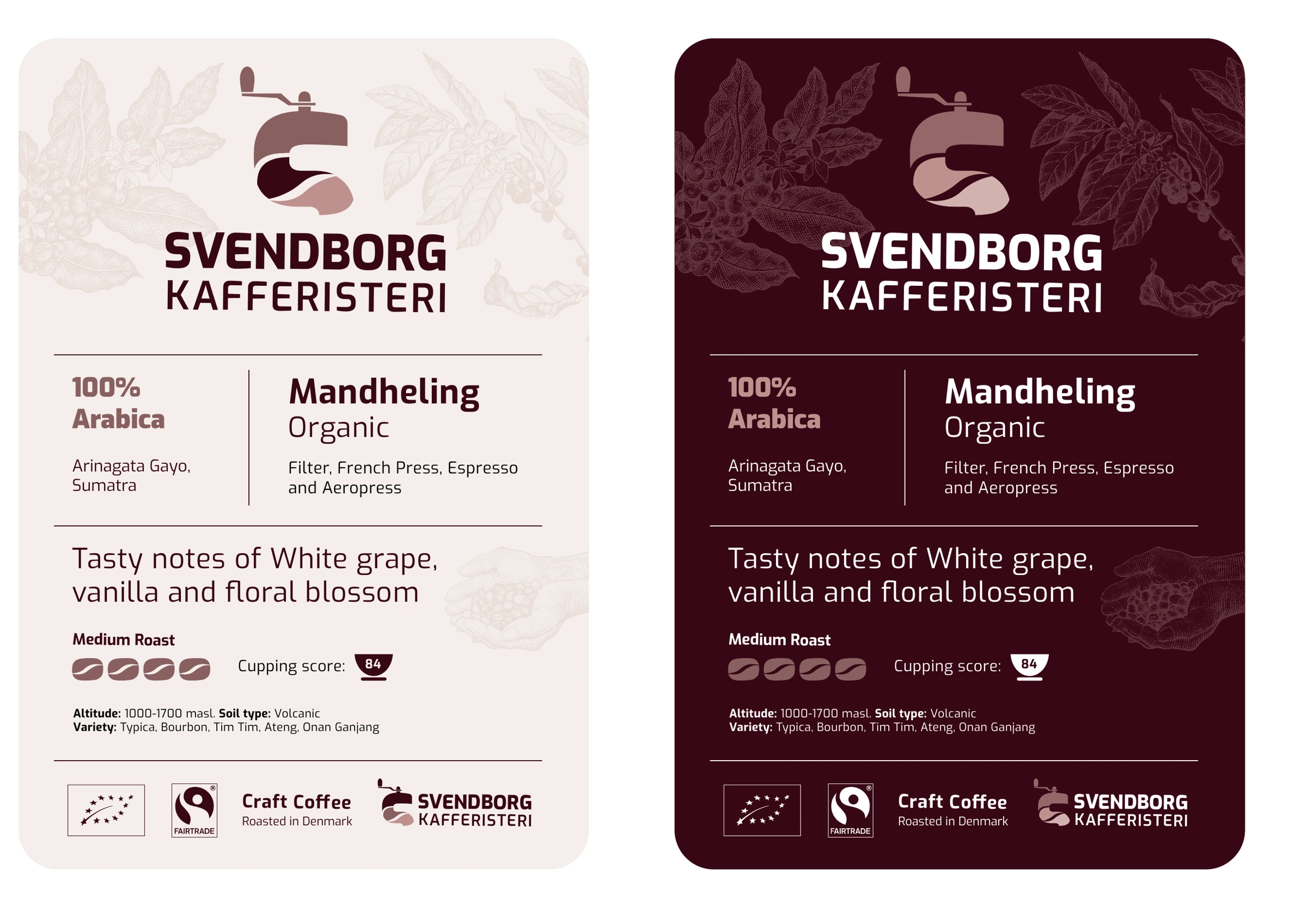
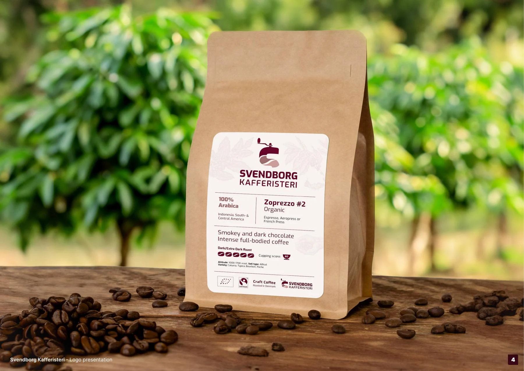
Room for the story of the coffee.
The label hierarchy makes room for origin, roast and tasting notes. The identity remains clear while the information gives each coffee its own character.
03 / 03
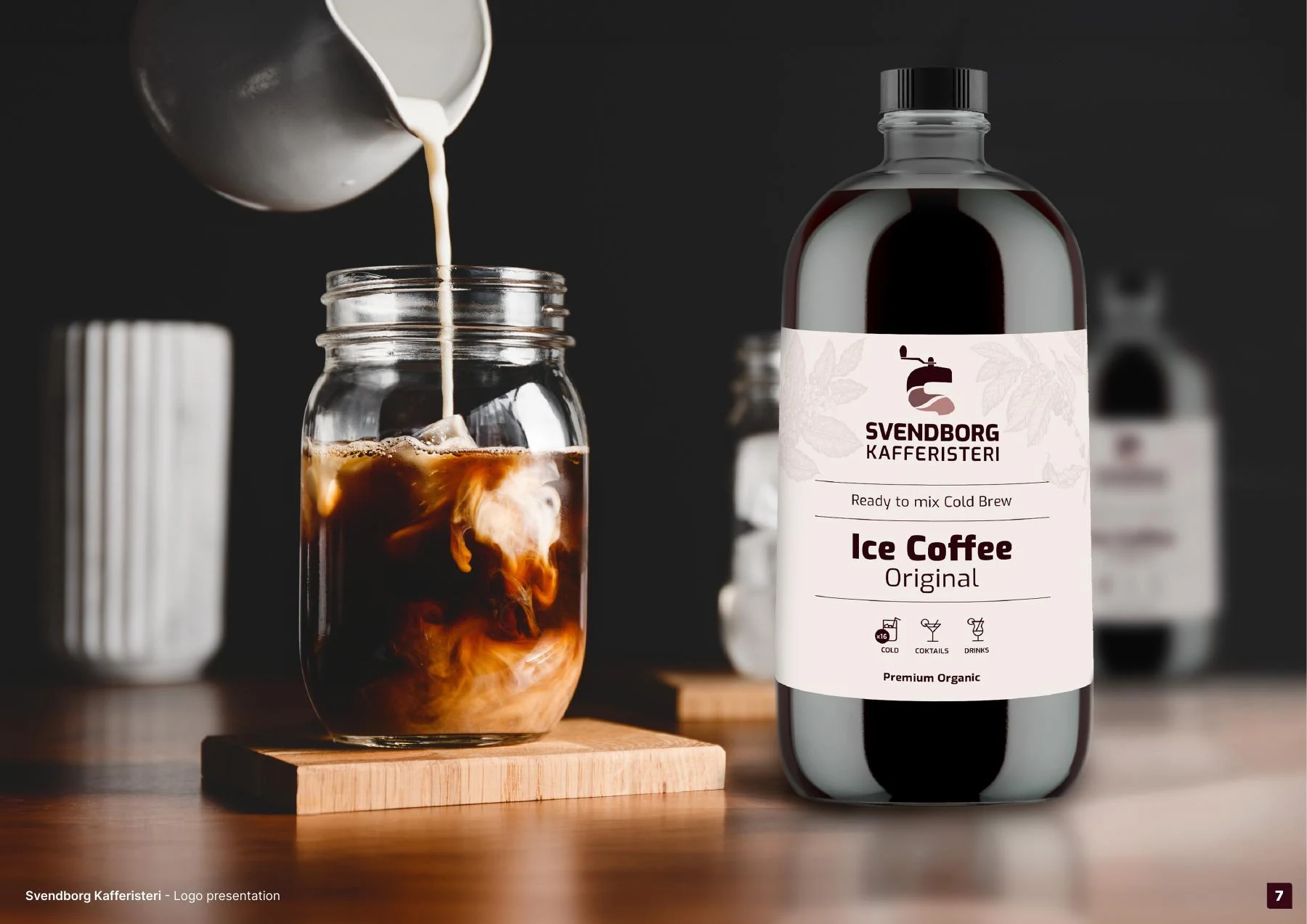
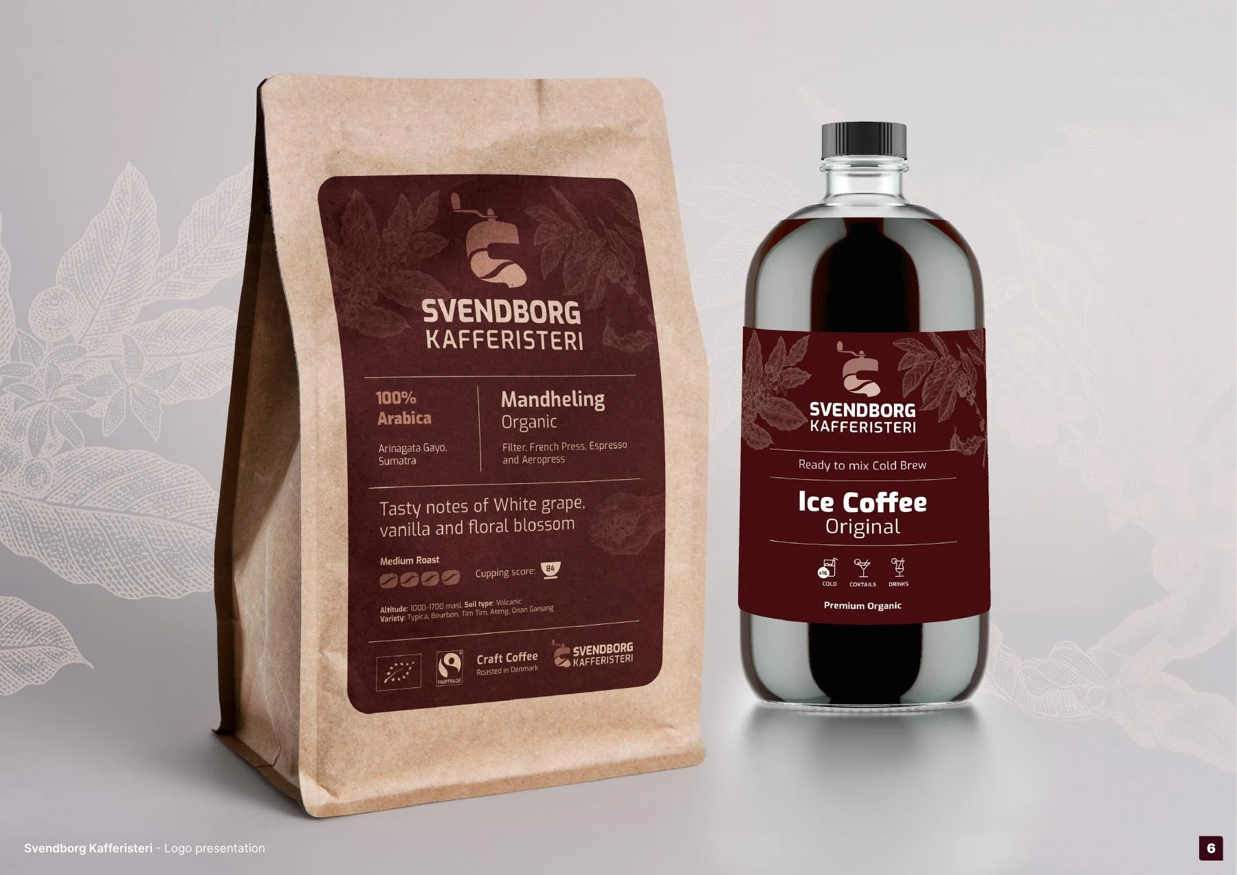
From a bag to a bottle.
The same identity moves between whole-bean packaging and bottled iced coffee. Burgundy, cream and clear typography keep the family connected.
Visual identity and packaging by Björgvin Guðjónsson.