HR-ON
One idea. A family of expressions.
A visual system for a software brand, connecting one core identity with a growing family of products and communications.

Switching on a cloud.
Circular forms bring a cloud and a power-on symbol together. Lettering modified from Helvetica gives the software brand a clear signature in both stacked and horizontal arrangements.


A system that can grow.
Core, Recruit, Staff and Suite belong to one family. Shared shapes and a consistent wordmark keep the products connected; colour and supporting symbols make their differences visible.
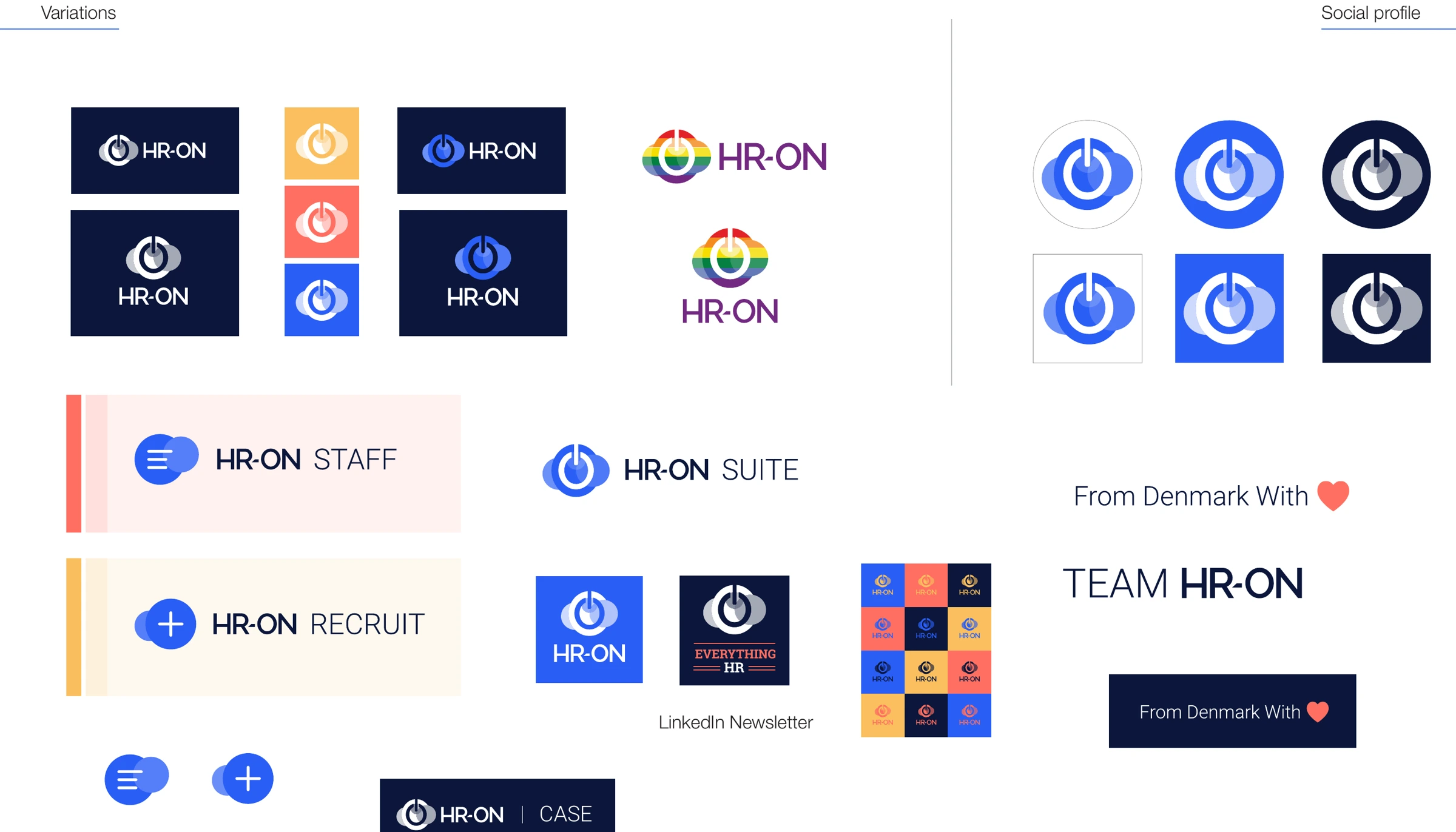
One blue. A wider palette.
Ice Blue anchors the system. Dark Ice supports contrast, while Living Coral, Fress, Prince and Princess Peach bring a wider range of accents into the product family.
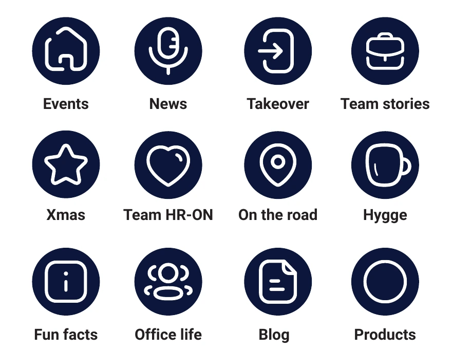
Small details, recognisably HR-ON.
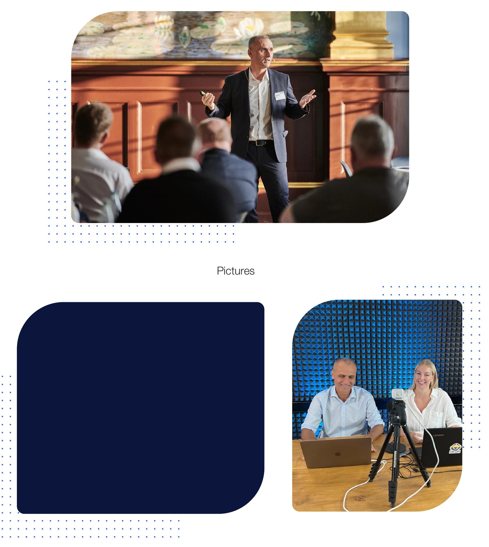
A set of circular icons gives stories, events and everyday communications a shared visual language. The rounded shapes also carry into the photographic treatment.
Brand identity and guidelines by Björgvin Guðjónsson. February 2023.