Fjallborg
A mountain city. A solid foundation.
A logo and identity for an Icelandic construction and investment company. The name Fjallborg—“Mountain City”—becomes a direct, distinctive mountain symbol.
A mountain city, in three parts.
Fjallborg means “Mountain City.” The peaks give the name a direct visual form. A compact F and modified lettering extend the identity without losing its connection to the primary mark.

A consistent family of marks.
Teal connects the identity across stacked and horizontal signatures. Single-colour forms and compact profile marks keep the design practical across applications.
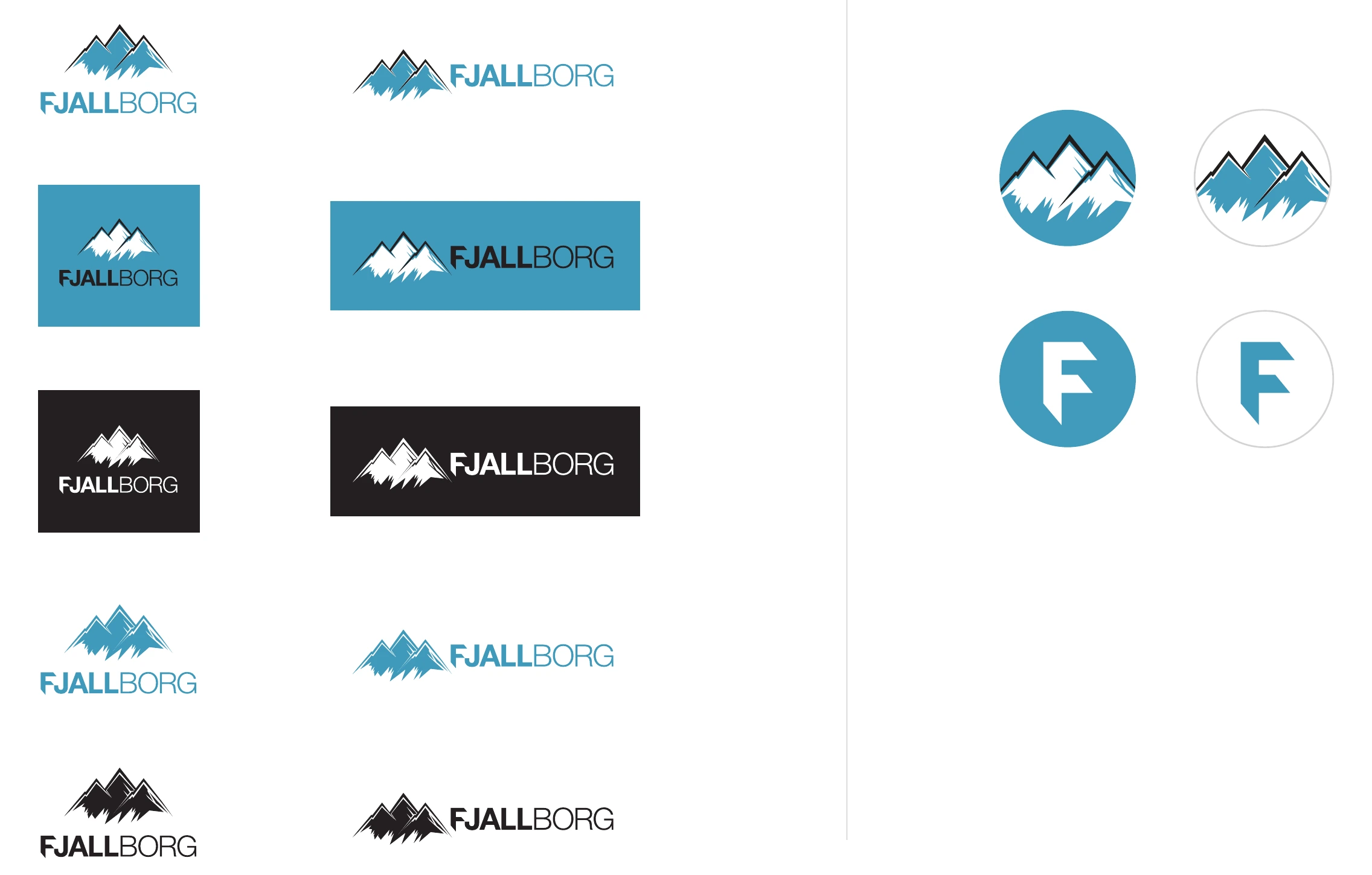
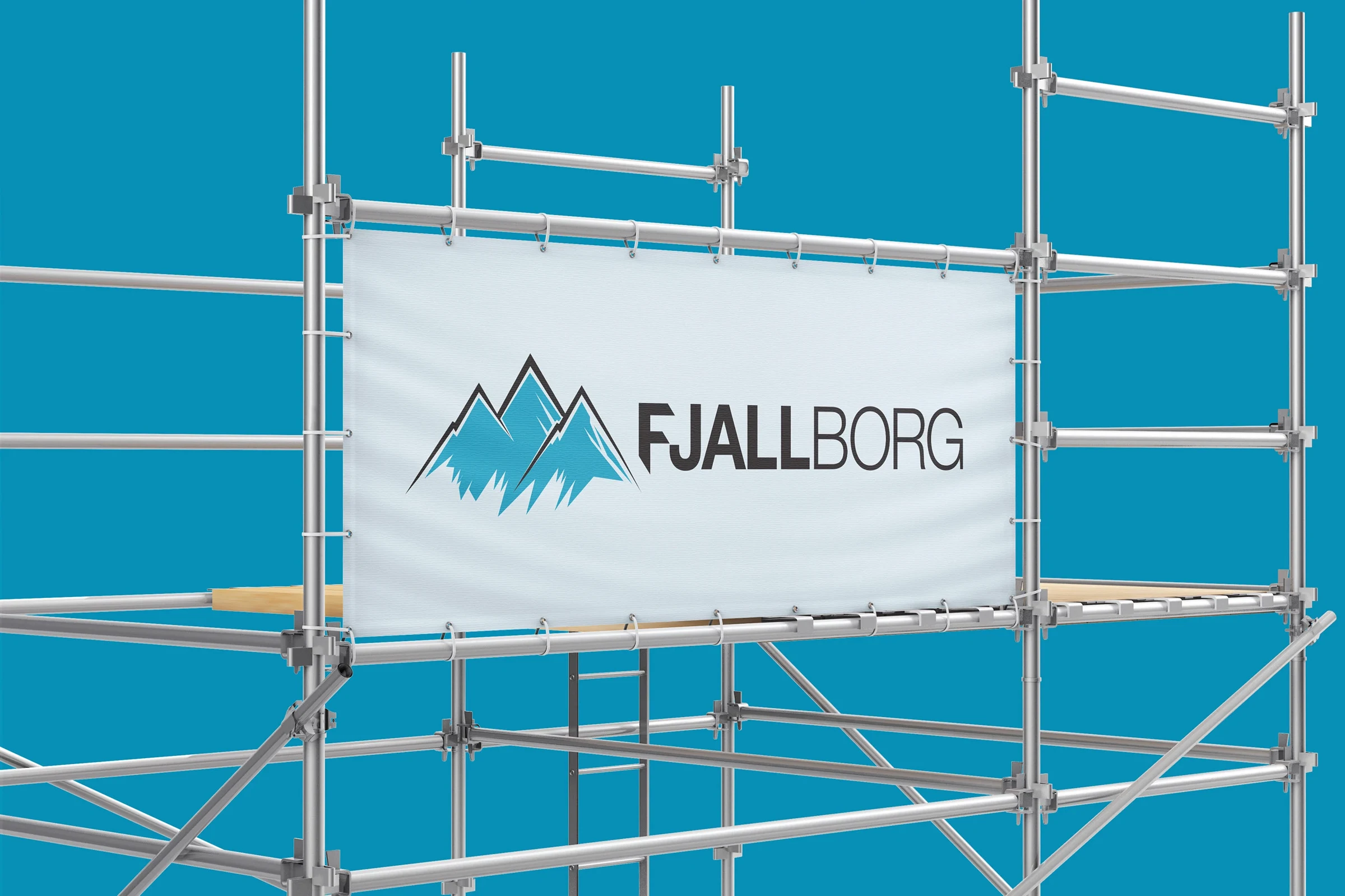
At the scale of a building.
The mountain symbol becomes a clear signature on a scaffold banner, connecting the company to the work taking place behind it.
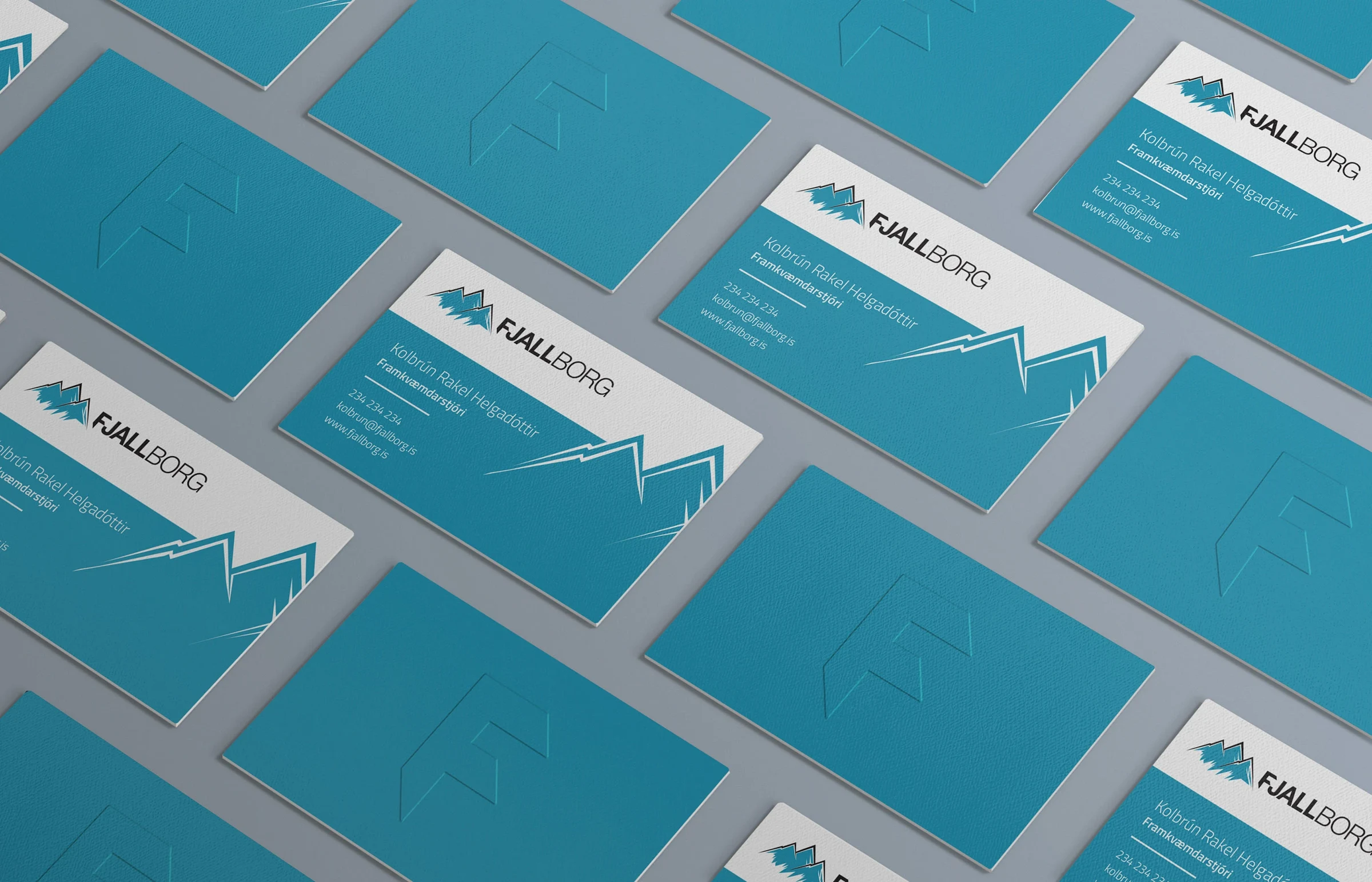
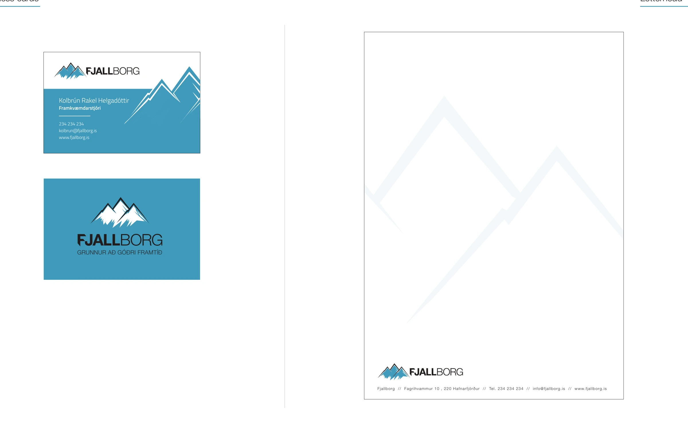
From the site to the desk.
Mountain forms extend into the supporting graphics on business cards and stationery. A restrained layout gives the identity a solid, consistent presence.
Logo, modified typography and visual identity by Björgvin Guðjónsson. Published in 2021.
Also on Behance ↗