Hverdags Humanisten
A human idea, given a human shape.
An identity package for a humanist blog, designed for a friend and colleague. An open, embracing figure gives the words a warm and recognisable companion.
01 / 02
An open gesture.
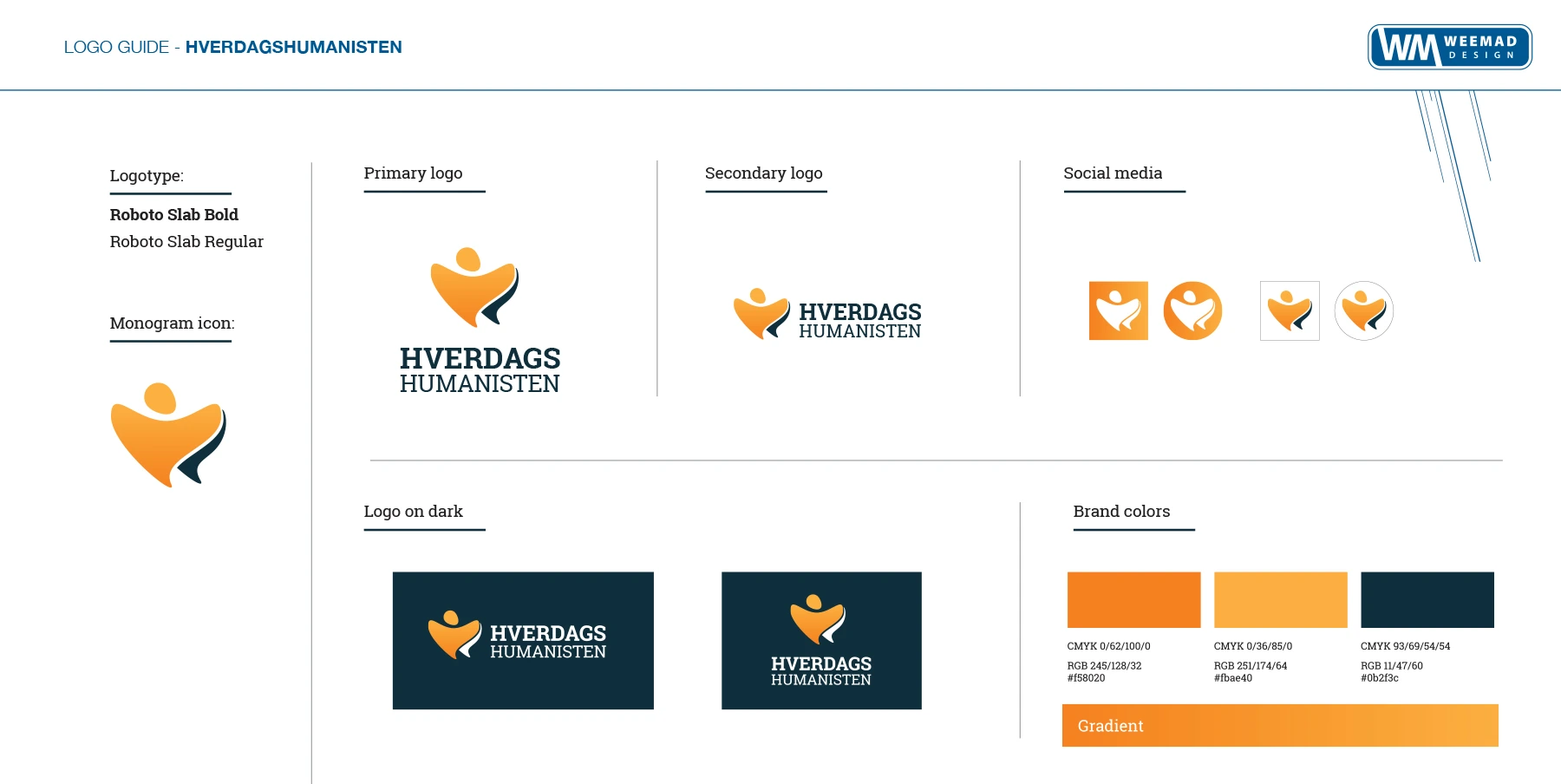
A simple figure anchors the identity. Orange and dark blue connect the symbol, wordmark, secondary lockups and social-media variations.
02 / 02
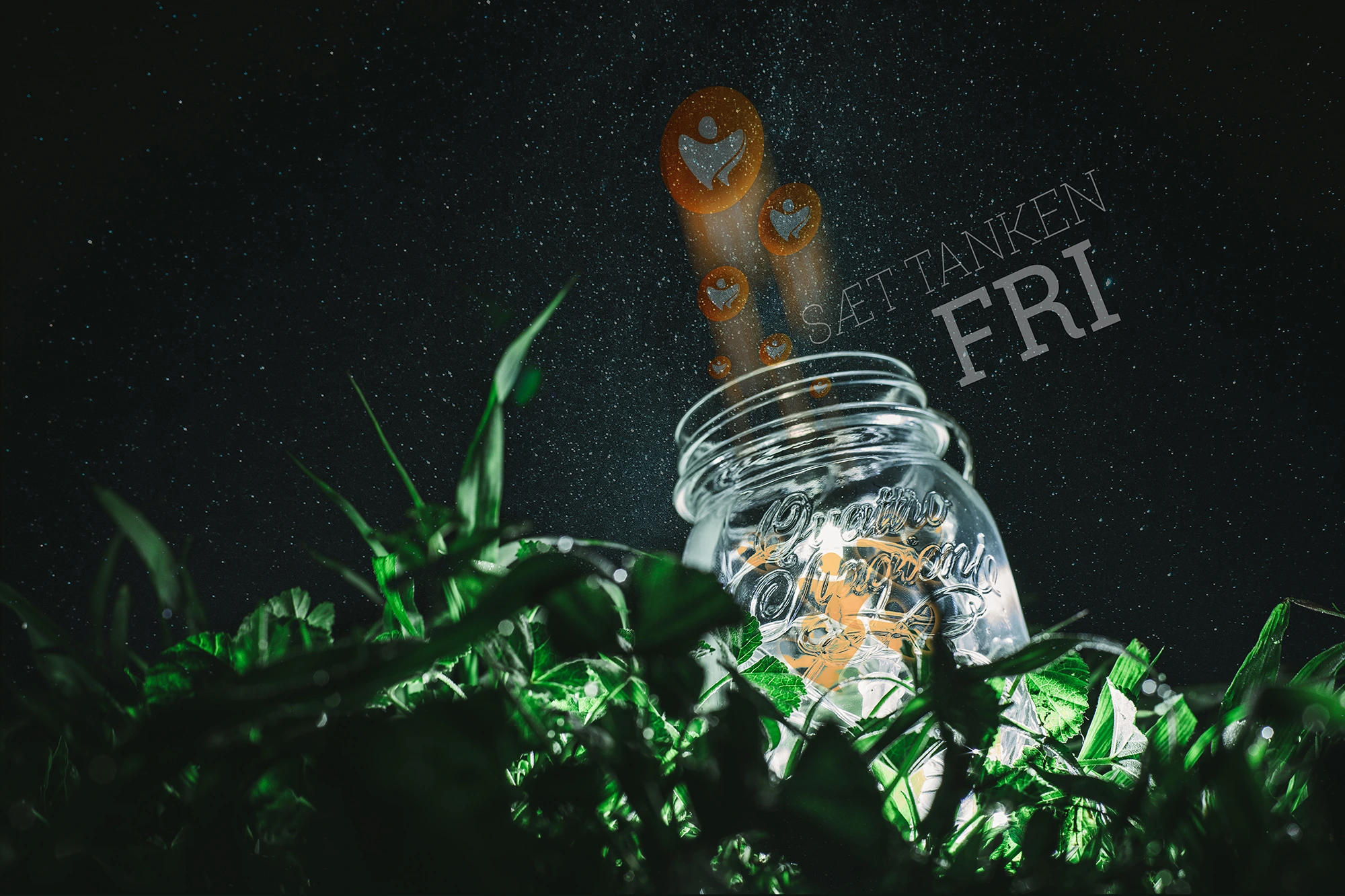
Free your mind.
The visual language moves from a quietly embossed mark to an imaginative illustrated scene.
Logo and identity by Björgvin Guðjónsson. Original guide and visual applications from weemad.com.